How to Rock your Conversion Rate with high contrast buttons

Your a smart cookie; you know that using buttons for your 'add to cart' and 'checkout' navigation will increase conversions. It's just a fact - people are more likely to click on a button than they are a hyperlink.
But not all buttons are created equally. Are you aware that on most websites, red buttons will usually convert more online traffic than blue buttons? This has nothing to do with the colour red; rather it's owed to the fact that high contrasting buttons are more easily seen and have higher CTR's. Thus, for a pink website, a blue button would be the better choice. Pretty straightforward stuff.
But there is one rule you must follow to prevent an aesthetic nightmare and benefit from better buttons.
How to rock your conversion rate with high contrast buttons
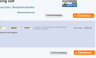
The first thing to do is use them sparingly. Personally, I like using bright red buttons for the key navigation steps that lead to a sale i.e. the "add to cart" button "checkout" buttons. These are the actions you want your visitor's to take. For actions you don't want your customers to take, but still warrant a button, a more diffused version of your high contrast button or perhaps a neutral grey button would be the ideal choice.
The right way to mix two button schemes
The emphasis here is for people to press the checkout button. "continue shopping", 'delete' and 'update' are less likely to earn you a sale; thus, they remain subservient to the site design.

The Wrong way
Not only is this an aesthetic nightmare, but you are promoting actions you don't want people to take, like pressing the "delete" button.


So it work's just like misdirection does in magic.
ReplyDeleteNice post Victor.
I found your blog quite interesting. Thanks for sharing this blog..
ReplyDelete