
Making it easier for senior citizen's to christmas shop online
I had a good idea how to handle the color selection attribute when selling products. It doesn’t work with products where there are multiple options (i.e. sizes and colors), it is really just limited to products with only a few options.
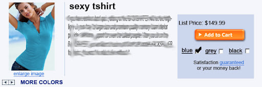
This type of color selection attribute is superior as far as usability design goes. You have two options for changing the product color: 1. press the arrows below the ‘enlarge image’ link or 2. click a check box below the ‘add to cart’ button. Note: if you change the product color by pressing the arrow buttons, the check boxes will change accordingly. This type of redundant selection system is intuitive and obvious to even the most computer illiterate customer – also, it should be easy to run for older browsers.A more ergonomic design for color selection
Its easy to take your computer skills for granted; but many potential customers – particularly elderly ones with lots of disposable income – have to struggle to understand basic computer applications. Seriously, you would be surprised how many people have to write down, on a piece of paper, how to do simple things like log into their email (with step 1 being turn on the computer). Respect this affluent demographic! There are millionaires that call tech support because they can’t figure out how to attach a file to their email and I have heard stories about people using their cdrom drives as cup holders. – These people do exist and they aren’t stupid, just computer illiterate (with lots of disposable income).
The main problem with most attribute systems is their dependence on drop-down menus. Drop-down menu’s are a lot harder to use than you think. A 2003 research study conducted at the University of Maryland by Ben Shneiderman, Ph.D. observes that some elderly users don’t know how to use drop-downs – making your site a struggle. Apparently even savvy users encounter usability problems, as a drop down menu requires an extra click and thus slows down persuasive momentum. Here is the usability guidelines report [PDF].
Drop-downs also will make your user pissed off. For one, they reduce the transparency of your product options, making learning about a product a chore - this will turn into an alienating and frustrating experience for disabled customers lacking fine mouse coordination. Think about it, have you ever had a drop down close on you before being able to select an option? Well multiply that frustration by a 1,000 if you want to imagine what it must be like for someone who has trouble aiming the mouse. If another usability problem immediately manifests – such as your customer accidentally changing the drop-down selection with the mouse scroll wheel - their frustration will be multiplied even more. Even if your customer doesn’t bail on your site at this point – their trust and confidence in your business will be burst. And lack of trust is a notorious killer of online sales, especially with computer illiterate demographics.
Do you sell a product that could benefit from this attribute system?


Hi sir, it's me here Timothy, nice content you have posted there! I just want to know your views on Clcik Monopoly Review .
ReplyDelete